
HTML WYSIWYG editors were built to democratise publishing, and they largely succeeded. Non-technical contributors can format text, add images, and publish quickly. The downside appears when every option is available to everyone, creating pages that look strikingly similar only in how inconsistent they feel. Custom toolbars introduce gentle guardrails that preserve creativity while protecting brand identity.
Restricting tools doesn’t slow teams down; it often makes them notably improved in speed and confidence. When writers aren’t deciding between six fonts or dozens of colours, they focus on clarity. The result is content that feels intentional rather than improvised.
Why Toolbar Customisation Matters
Giving someone full control of a CMS toolbar is a bit like handing over the keys to a newsroom without an editor present. Most contributors mean well, but design decisions are rarely their primary skill. Over time, small deviations accumulate. A heading here is slightly larger. A colour there is almost on-brand. Eventually, the site starts to feel uneven.
Research groups like Nielsen Norman have long shown that visual consistency directly affects trust. Readers may not articulate what’s wrong, but they feel it. Inconsistent layouts quietly undermine credibility, especially when users move between pages expecting a coherent experience.
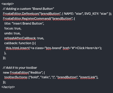
Understanding the HTML WYSIWYG Toolbar
A standard WYSIWYG toolbar is deceptively powerful. Bold, italics, headings, alignment, colours, tables, embeds—all of it sits a click away. Each button alters the page, sometimes permanently. When too many controls are exposed, even experienced users experiment, often without realising the downstream effects.
The toolbar is not just a utility. It is a policy surface. What appears there defines what is acceptable, repeatable, and safe.
Links and images
Links and images tend to introduce subtler problems. Contributors paste URLs with inconsistent anchor styles or upload oversized images that disrupt layouts. Without guidance, visual rhythm suffers. Limiting alignment options, standardising image insertion, and predefining link behaviour prevents these issues before they appear, keeping pages readable across devices.
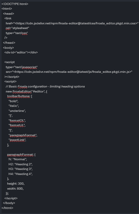
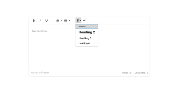
Strategy 1: Limit Heading Options
Heading misuse is one of the most common CMS problems. Writers often choose headings by visual size rather than structure, leading to broken hierarchies. By restricting options to H2, H3, and H4, teams are nudged toward logical flow rather than personal preference.
This approach is remarkably effective because it removes ambiguity. H1 remains reserved for templates. Lower-level headings disappear. The page reads more clearly, and accessibility improves without additional training.
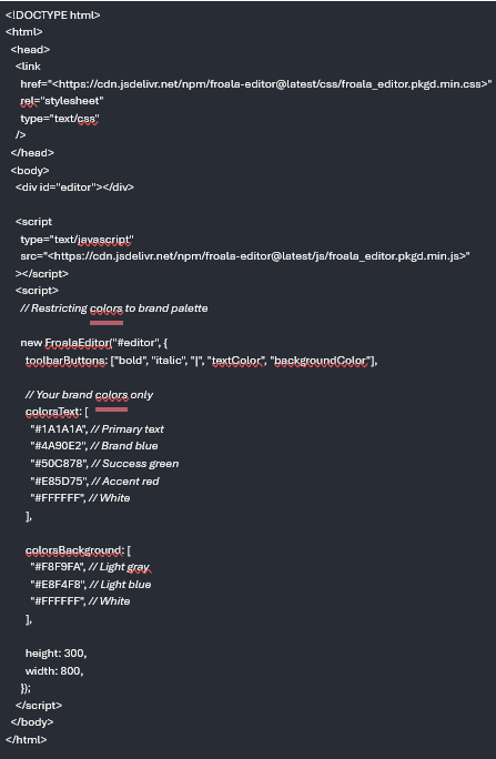
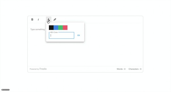
Strategy 2: Lock Down Your Color Palette
Unlimited colour pickers invite chaos. With millions of options available, contributors inevitably select shades that clash subtly or dramatically. Restricting choices to brand-approved colours keeps emphasis intentional and pages visually calm.
This constraint is particularly beneficial for larger teams. Writers still highlight important information, but only within a palette that supports recognition and trust.
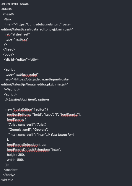
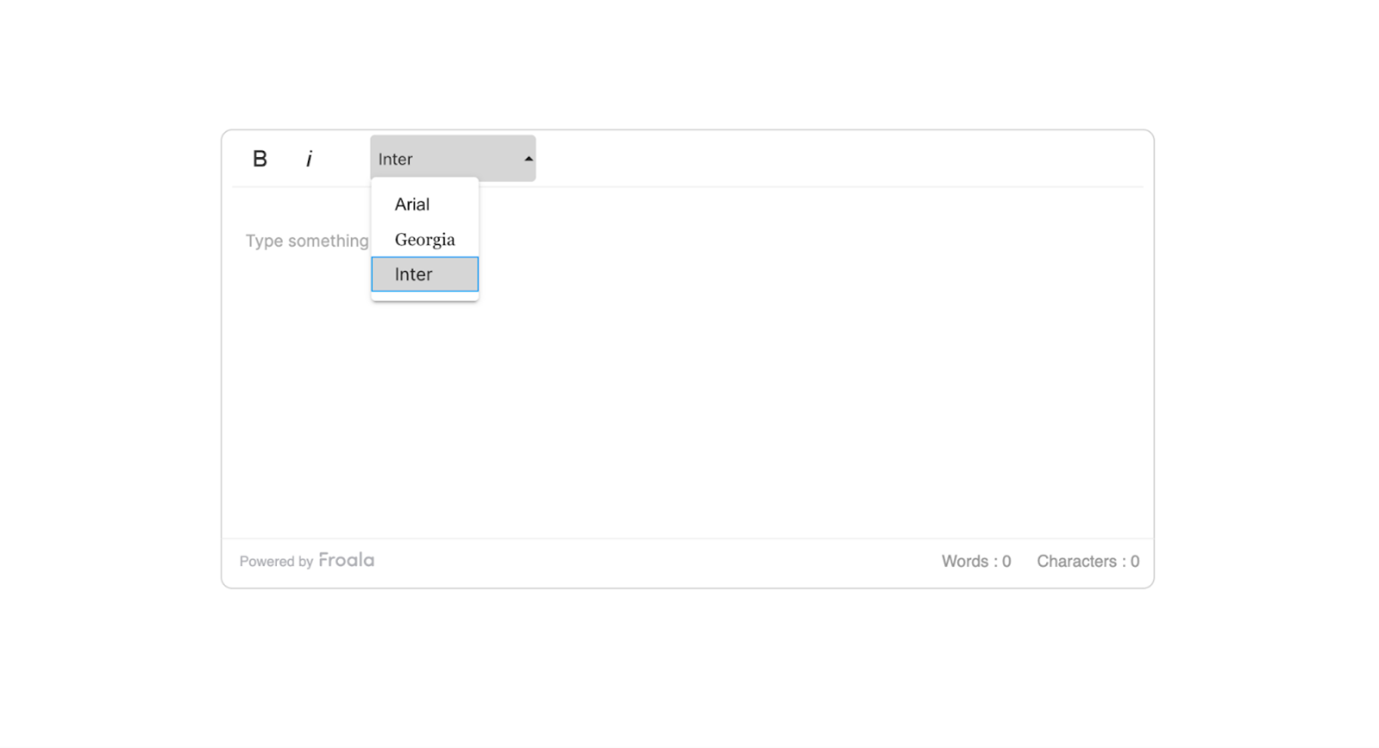
Strategy 3: Control Font Choices
Fonts carry personality. Allowing too many at once fractures that personality quickly. Most brands need one primary font and perhaps a secondary accent. Limiting font options also reduces page weight, making sites significantly faster and more reliable across browsers.
Readers may never consciously notice font discipline, but they feel its absence immediately when it’s missing.
Strategy 4: Set Safe Formatting Defaults
Not every solution requires removal. Smart defaults quietly guide behaviour. Clean paste rules prevent messy imports from documents. Grouped toolbar sections reduce cognitive load. CSS-driven styles replace inline overrides.
At this point, it became clear to me how much frustration teams accept as normal simply because the tools allow it.
Defaults shape habits. Habits shape content.
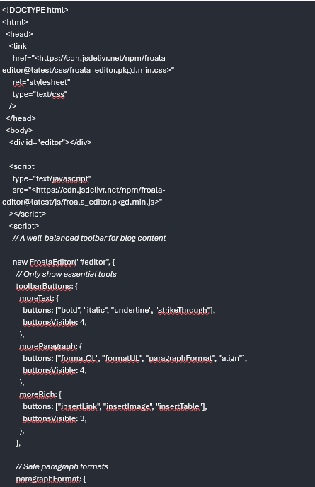
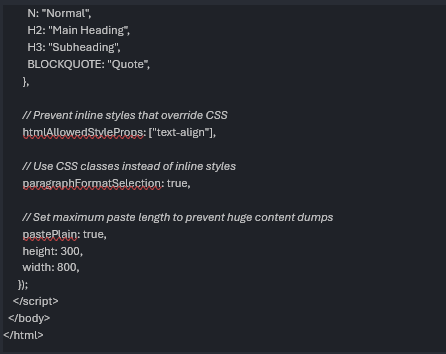

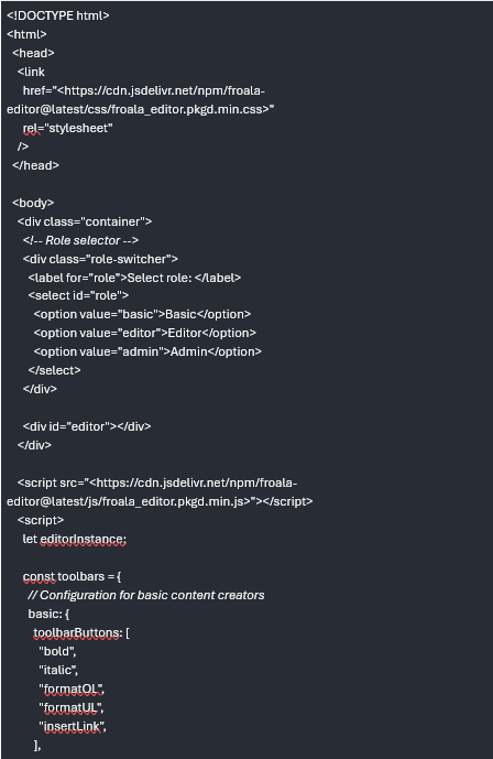
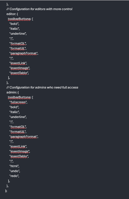
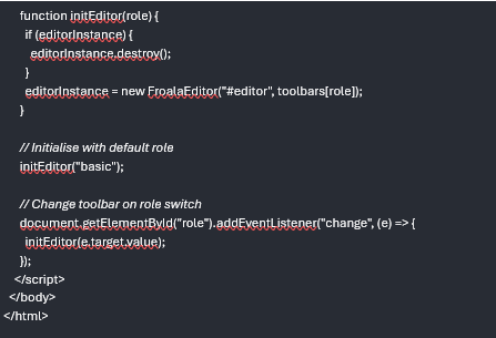
Strategy 5: Create Role-Based Toolbars
Not every contributor needs the same power. Junior writers benefit from simplicity. Editors need review tools. Administrators require full access. Role-based toolbars reflect responsibility, not hierarchy.
This structure prevents accidental damage while preserving flexibility. It also reduces support requests, as fewer users can break complex layouts unintentionally.

Best Practices
Start restrictive and loosen gradually. Document decisions clearly. Test formatting on mobile early and often. Prefer CSS classes over inline styles. Short training sessions pay dividends. These practices keep systems adaptable without drifting into disorder.
Common Pitfalls
Over-restriction frustrates users and invites workarounds. Ignoring accessibility undermines usability. Failing to test paste behaviour leads to hidden formatting debris. Responsive issues emerge when desktop previews are trusted too much. Toolbars should evolve, not fossilise.
Measuring Success
Success shows up quietly. Less time spent cleaning pages. Fewer complaints from writers. Faster load times. More consistent typography. Support tickets decline. These signals reveal whether the system is working better than before.
Why It Matters
Custom toolbar strategies are not about control for its own sake. They are about trust—trust that every page reflects the same standards, regardless of who published it. When boundaries are clear, creativity operates inside them confidently. The CMS becomes a partner rather than a risk. Over time, that consistency compounds into something readers recognise immediately, even if they never quite know why.


 Bitcoin
  Ethereum
  Tether
  BNB
BNB  XRP
XRP  USDC
USDC  Solana
  Cardano
  Avalanche
  Toncoin